Fintechs disrupt once again Contemporary brand design proves it’s more than just another pretty face
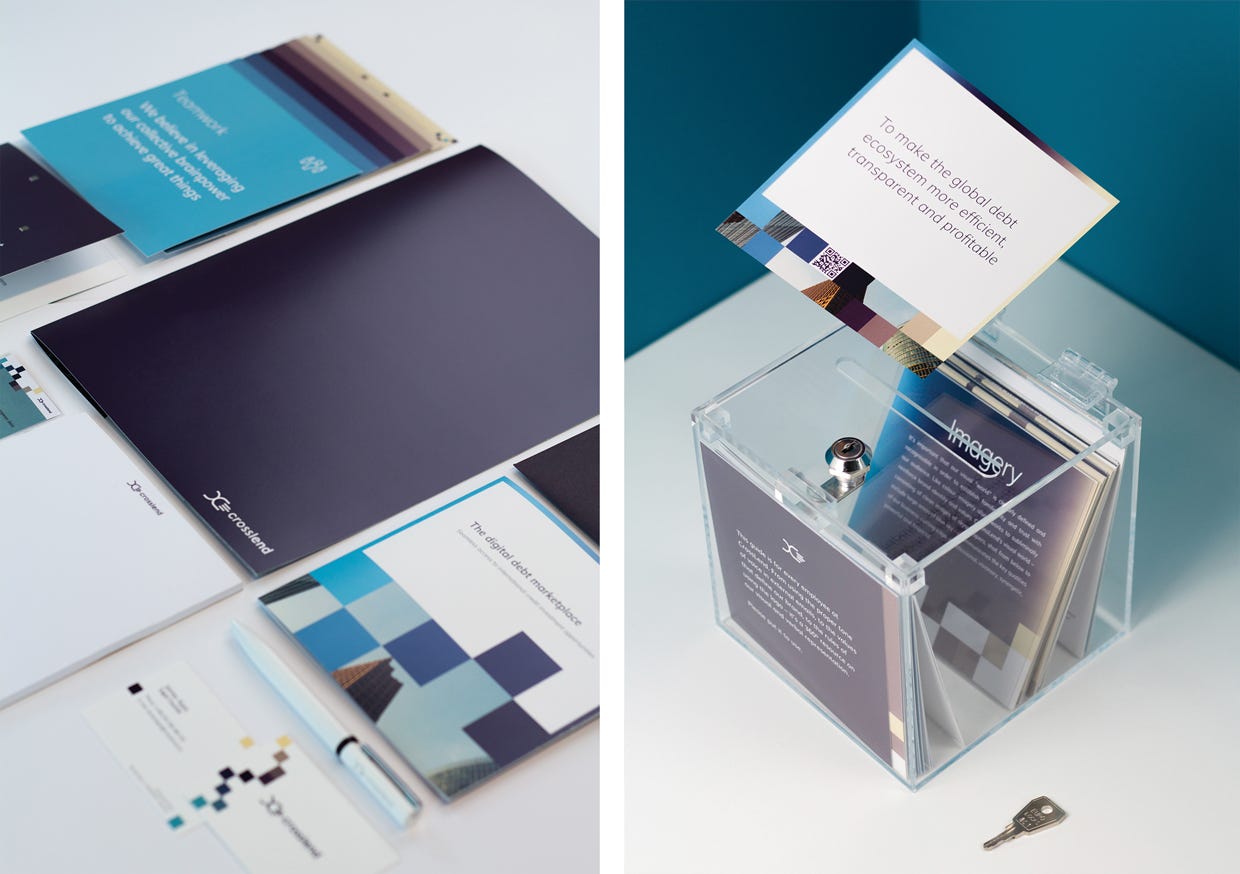
This year, CrossLend was honoured to receive two awards: German Design Award for “Excellent Communications Design — Brand Identity” and German Brand Award in the category “Excellent Brands — Banking & Financial Services” Being recognised with these made us reflect on the current state of design and branding across the finance world and how this traditional industry is transforming with cutting edge design.
You may have noticed that in recent years, the finance world has become much more aesthetically pleasing. No, we’re not talking about the widespread use of plastic surgery; we’re talking about a different kind of facelift that many traditional finance brands have started to embrace. These new makeovers are characterised by a sudden rise in streamlined contemporary logos, edgy typography and bold colour choices. There could only be one glaringly obvious trendsetter behind this: the industry newcomers, fintechs.
Communicating a fresh, technology-focused approach
Here’s a metaphor for the effect of fintechs on the finance world: imagine an elderly chairman of the board sitting in traffic in the backseat of a limousine. All of a sudden, an attractive youth flies by, weaving effortlessly through the gridlocked streets on a sleek, electric motorcycle. As the gentleman stares after the fading taillights, not only does he recognise he’s been left in the dust, he can’t help but notice he’s been overtaken in style by a vehicle much better suited to today’s gridlock roads. He might conclude, that the world has changed, changed utterly and surrender or he might decide to upgrade his mode of transportation.
In the last few years, in the realm of products and services, finance brands have witnessed as fintechs usurp territory previously reserved for the old guard. The edge that fintechs have gained is not only in terms of their streamlined, customer-centric products and services, but also an appealing, coherent look and feel through by branded design that communicates a fresh, technology-focused approach.
There’s an urgent need for financial institutions to upgrade their branding for the digital world, and digitally transform.

Without a psychological depth behind the brand, it’s just smoke and mirrors
Design without psychological depth, is just a pretty façade which crumbles as soon as the surface is scratched. With the communication of stability and trust being central to finance, having such a flimsy veneer holding up their identity is the last thing any financial institution wants holding up their identity
Nevertheless, banks have been slow to recognise the value of branding, as confirmed by The Design Channel. Most financial institutions earmark little of their annual operating budgets to brand activities.
In an industry so intimately wed to numbers and facts, it’s not surprising that playing it conservative has long been the modus operandi when it comes to both design and branding. Until quite recently, companies had no solid proof that design, and by extension branding, was a sound investment. That all changed in 2018 when McKinsey released a ground-breaking study, employing “the most extensive and rigorous research undertaken anywhere”, to assess the business impact of design. McKinsey tracked the design practices of 300 publicly listed companies and reported that design is a fundamental driver of business success and is “the only way that companies can stand out from the crowd” /1/.
And there’s yet another compelling argument, beyond the world of numbers: Psychological factors influence our decisions, even those based on logical arguments. Brands exists in consumers’ mind as a blend of feelings, memories and personal experiences connected to a product or service.
Born in the digital world, most fintechs have not stopped to question the value of branding. Without decades of customer relationship building, they’ve had to quickly gain trust and establish their identity from the ground up; in a media environment flooded with clickbait and attention-grabbing headlines. These measures have played a significant role in their success, as demonstrated by the recent large-scale re-branding projects undertaken by “traditional” financial institutions.
Case 1, Halifax: What could be more telling than Marketing Week’s headline for the Halifax bank brand re-launch in spring 2019: ‘We don’t want to be seen as the old guard’, says Lloyds Banking Group’s director of communications and marketing. ‘The bank overhauled its logo and visual identity, as well as its marketing, in a bid to make the brand more contemporary and relevant amid rising competition from fintech startups…” …”. This was done in a bid to humanise the concept of banking. Their strategy is based around the concept of “fintech meets humanity” according to Carlo D’Alanno, executive creative director at Rufus Leonard, who was behind the creative. Halifax aimed to stand out among the competition by being simple, straightforward, and easy to engage with /2/ /3/.
Case 2, Milleis: In 2017, European financial services private equity firm AnaCap acquired Barclays France and proceeded to rebrand it as Milleis, a modern bank with a modern style and identity. Alongside the name change, a new colour palate was chosen for bespoke bank Milleis — it is warm and inviting yet earthy. Thanks to branding experts Carré Noir, Milleis has positioned itself as being very distinct from other French banks, whose colour schemes mostly revolve around the primary colours. The fonts and icons chosen for Milleis combine geometric shapes with a round and stable character. Overall, the brand’s look and feel is warmer and more inviting than its competitors, adjectives that didn’t used to be associated with financial brand identities. /4/
Case 3, NatWest: Another interesting study is UK bank NatWest’s 2016 logo redesign, which breaks away significantly from traditional banks’ visual style. “We wanted to create a brand that was different and which stood out,” 7 says Dan Witchell, executive creative director at FutureBrand, the agency responsible for the work. In an article on the re-design in Marketing Week, RBS Group’s CMO David Wheldon RBS Group makes the startling admission that, “For too long at banks, advertising hasn’t been taken seriously (by other departments) — it is that thing the strange people over there in the corner do. We want to change that for good.” Alleluia to that.
Is branding for B2B space as relevant as in B2C?
The above examples all come from the B2C space but what about business to business where CrossLend operates? Why should leading-edge design and branding be as relevant here as for public-facing companies?
In today’s information-rich world, everyone can be a decision-maker. The same psychology-based design principles that inspire confidence in consumers also positively impact institutional decision makers. An award-winning brand design can be credited as a contributing factor to CrossLend’s business growth. No one can say we creatives don’t appreciate crunching numbers too.

/1/ https://www.mckinsey.com/business-functions/mckinsey-design/our-insights/the-business-value-of-design
/2/ https://www.underconsideration.com/brandnew/archives/new_logo_and_identity_for_halifax_by_rufus_leonard.php
/3/ https://www.marketingweek.com/halifax-relaunch-brand/
/4/ https://www.privateequitywire.co.uk/2018/05/16/264273/anacap-owned-barclays-france-rebranded-milleis


Related articles
Securitisation: active management option to boost Luxembourg hub
The overhaul of Luxembourg’s securitisation laws introduced a number of changes, notably allowing for active management and a broader [...]
Originator Spotlight/Lenderwize
A fast-growing trade finance platform, Lenderwize specialises in invoice financing in the digital economy. Currently its platform provides its [...]
Digital lending emerges as an important sub-segment of private debt
Amid increasing breadth within the private debt asset class, specialised investors can allocate capital to sub segments in a bid [...]


